Have you ever wondered why most companies do a rebrand every few years, out of the blue, completely unprompted? The design team certainly does not just wake up someday and go, "yeah we should just redesign our identity."
There must be a reason to it, because humans by nature don't like change. Unless it's good.
Why we usually agree on Good Design
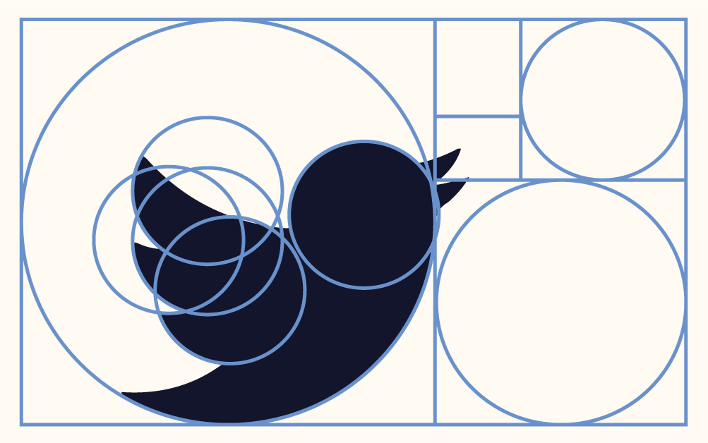
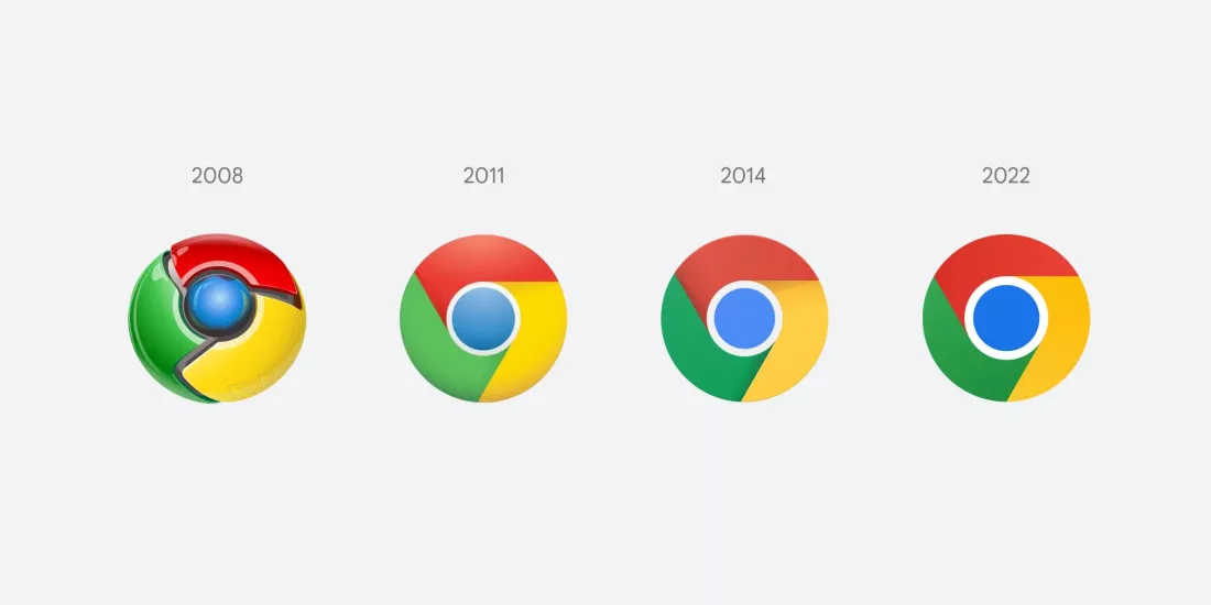
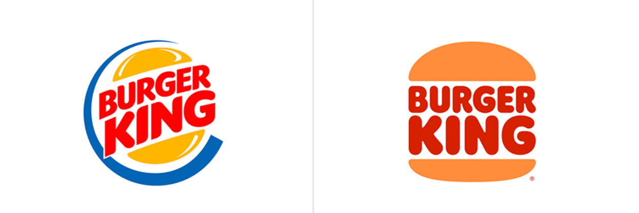
Good design is simple. It's elegant, and most importantly, it's relevant. Take a look at Chrome's early design and what we have now. It's a drastic change in the span of a decade. But if we were living in a timeline where Chrome's logo stayed at its 2008 variant, people will not be happy.
The old Chrome logo was bold, shiny, full of 3D effects and metallic glow that screamed "cutting-edge tech" in the era of skeuomorphism. But as design trends shifted toward simpler, minimalist interfaces (think Material Design), that glossy look starts to feel dated. This is why most apps, companies and even plain designs shift to those trends. Because you usually don't want to be the odd one out.
We accept (and even celebrate) those changes because good design evolves with us. It mirrors cultural shifts, technological advancements, and our changing tastes.
Or, in more american terms:
Judging covers
The phrase "don't judge a book by its cover" is great advice. Until it isn't. Our brains are wired for quick visual judgements, and that's okay, because usually our brains are right. Humans form first impressions in milliseconds. In a world full of choices, we rely on heuristics to decide what's actually worth our attention. Color, symmetry, simplicity, and relevance. Good design just taps into this by feeling intuitive and easy on the eyes.
Bad design on the other hand creates friction. Cluttered layouts, mismatched fonts, or outdated styles make us subconsciously think, "This feels cheap." Even if it really isn't.
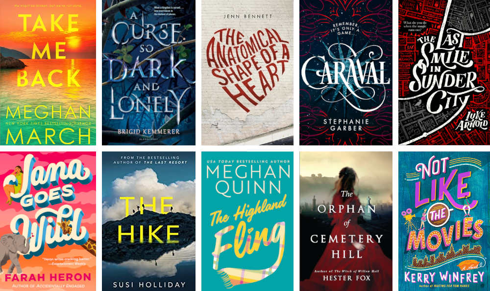
That's why a beautifully typeset, (literal) book cover makes us assume the story inside is worth reading.
Design is everywhere
Whatever you're doing in life, you most certainly make design choices everyday. If you're a writer, fonts, spacing and page design matters. If you're a developer, clean code matters, UI matters, those promote good Developer Experience, and User Experience. And if you're the guy behind IKEA, whatever you're doing is probably good.
The point: design isn't a separate skill; it's how we organize intention. And it's easier to start than you think. Put your thoughts on screen (or paper, or canvas), iterate, and refine. But most importantly, ask yourself: How does it look to you? If you like it, good chance is, everyone else will.
We judge covers because good design isn't superficial - it's a shortcut to trust, efficiency, and pleasure. Whether logos, books, UIs, or code, clean symmetry wins because our brains are built to love it.